

Terminal
Groundwork's terminal components for full-screen TUIs, built on OpenTUI and the terminal tokens.
Full-screen terminal apps use @timmo001/groundwork-tui: OpenTUI renderables and formatters on the terminal tokens, so every Groundwork TUI has the same header, lists, controls, dialogs and keys. Plain CLI output doesn’t use it. That stays on the terminal’s 16 ANSI colors, as Targets sets out.
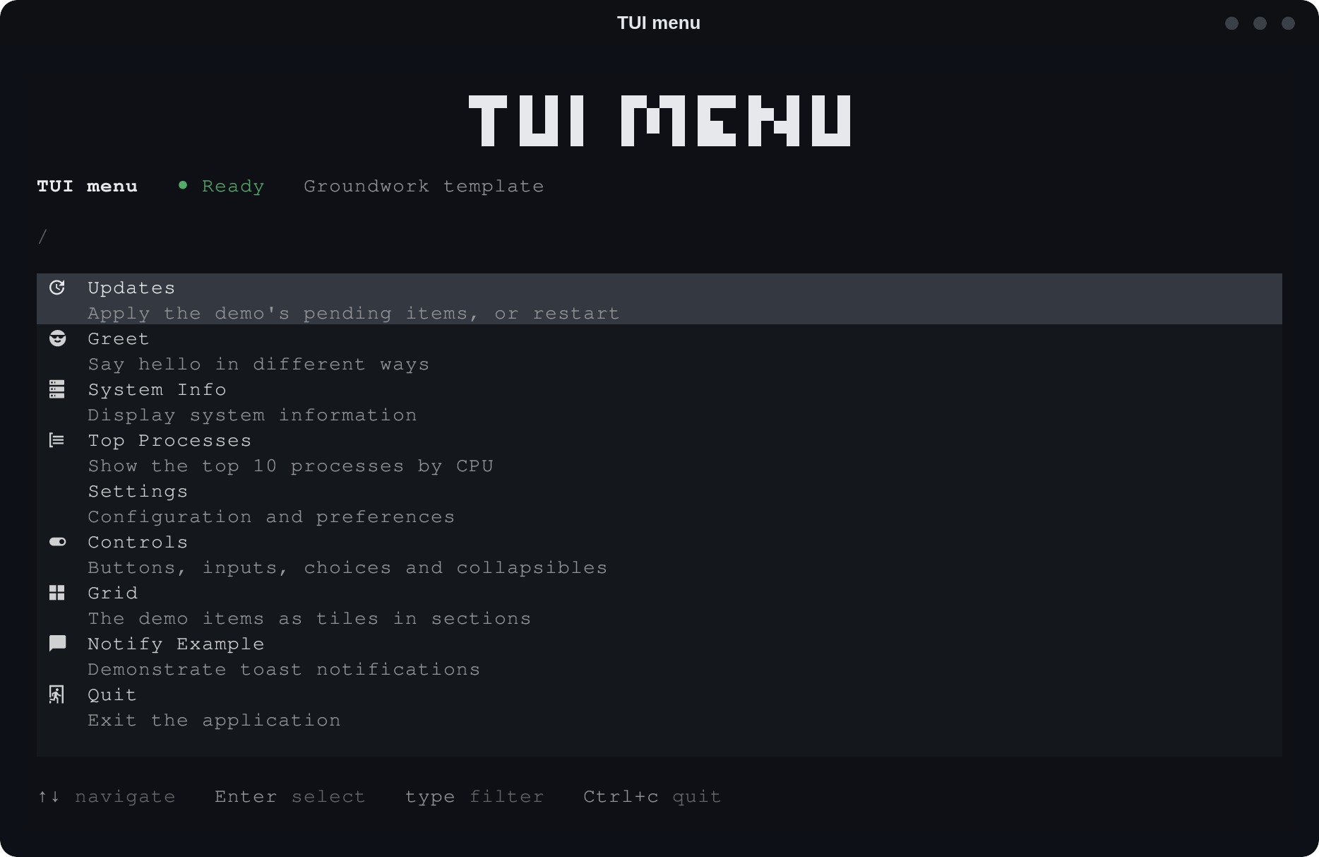
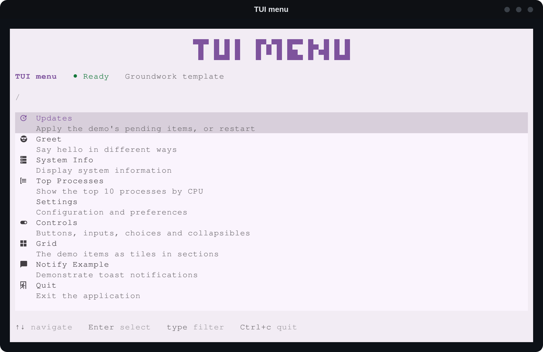
Themes
A TUI takes its colors from a core theme or the desktop’s Omarchy theme, picked by two environment variables:
| Variable | Values | Default |
|---|---|---|
GW_THEME |
A core theme’s id, such as base or slate, or omarchy |
omarchy where Omarchy is installed, otherwise base |
GW_MODE |
light, dark or darker |
The Omarchy theme’s own mode, otherwise dark |
The Omarchy theme is the one in use, read from ~/.local/state/omarchy/current/theme/colors.toml. It has its own mode, plus Darker for a dark one, so a GW_MODE it doesn’t have falls back to its own.
import { Effect } from "effect";
import { loadTheme } from "@timmo001/groundwork-tui";

const theme = await Effect.runPromise(loadTheme);
themeFor(id, mode) picks one directly, for an app with its own setting. For a theme picker, themeOptions lists the Omarchy theme and the core themes with the modes each has, and resolveTheme({ theme, mode }) turns the pick into colors. The demo’s Theme item does this and keeps the pick in ~/.config/tui-menu/theme.json. Since every view is built in its theme, it opens the renderer again in the new one.
Keys
Every view lists its keys along the bottom with formatHelpBar, so nothing has to be remembered.
| Key | Does |
|---|---|
| Up and Down | Move through a list |
| Left, Right, Up and Down | Move to the nearest tile in a grid |
| Typing | Filters the list |
| Enter | Selects, presses or applies |
| Tab and Shift+Tab | Move between controls and dialog buttons |
| Esc | Clears the filter, then closes a dialog or goes back |
| Ctrl+C | Quits from anywhere |
The mouse works too, once the app creates its renderer with useMouse: true, as the template does. A click runs a list row or a grid tile, presses a button, picks a choice or opens a collapsible, and the wheel scrolls. A grid passes clicks to its onActivate option.
Effect
OpenTUI has no Effect integration, so the components are plain renderables. Effect sits around them: loadTheme reads its config through Config, and the app’s services run in a ManagedRuntime wrapped as promises for the views. See Services.
Demo
templates/tui-menu is the TUI demo and a starting point for a new app. It runs on the shared Items service, like every demo:
mise run demo:tui
GW_THEME=slate GW_MODE=light mise run demo:tui