

Terminal components
The header, lists, grid, controls, dialogs and toast in @timmo001/groundwork-tui.
Each component takes the Theme from loadTheme. The demo in templates/tui-menu uses every one.
Header
HeaderBlock shows the app’s name as ASCII art when there’s room, over formatHeaderBar: a breadcrumb of where you are, a status dot and details that drop off as the terminal narrows. AppHeader and PaneHeader are one-row titles for smaller views.
Status tone |
Shows |
|---|---|
ok |
A green dot, such as Ready or Connected |
pending |
A yellow dot, such as Connecting |
error |
A red dot, such as Offline |
off |
A muted dot |
Lists
MenuList is a filterable list of two-line rows: an icon, a title and a description. Typing filters it, and the filter shows above it through formatFilterBar, always in place so the list doesn’t move. Long lists page, and rows can sit under group headings. Enter or a click runs a row. StatusList is a plain list of labeled values.
Grid
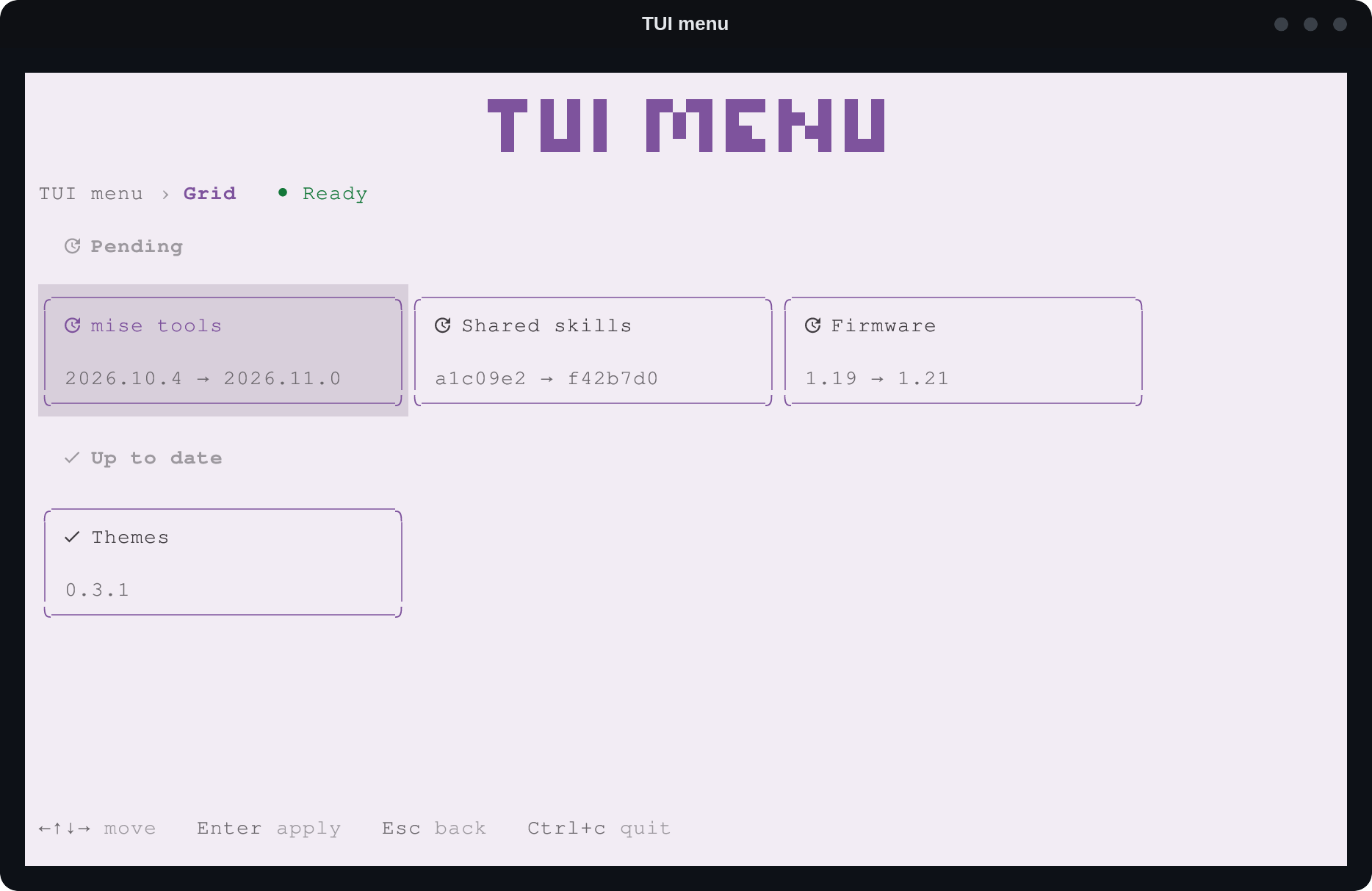
MenuGrid lays out Tile cards in sections, each under a SectionHeading. Tiles wrap to the terminal’s width, and the arrow keys move to the nearest tile in that direction, across sections too. A click highlights a tile and calls onActivate with its id.
Controls
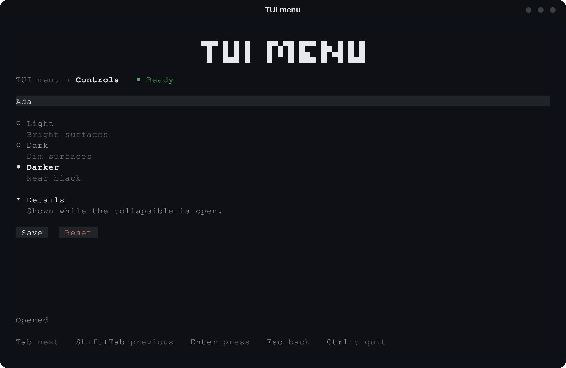
Button, Input, RadioGroup and Collapsible take focus in turn with Tab. Enter or Space, or a click, presses a button, picks a choice or opens a collapsible. A button is primary, neutral or destructive.
Dialogs
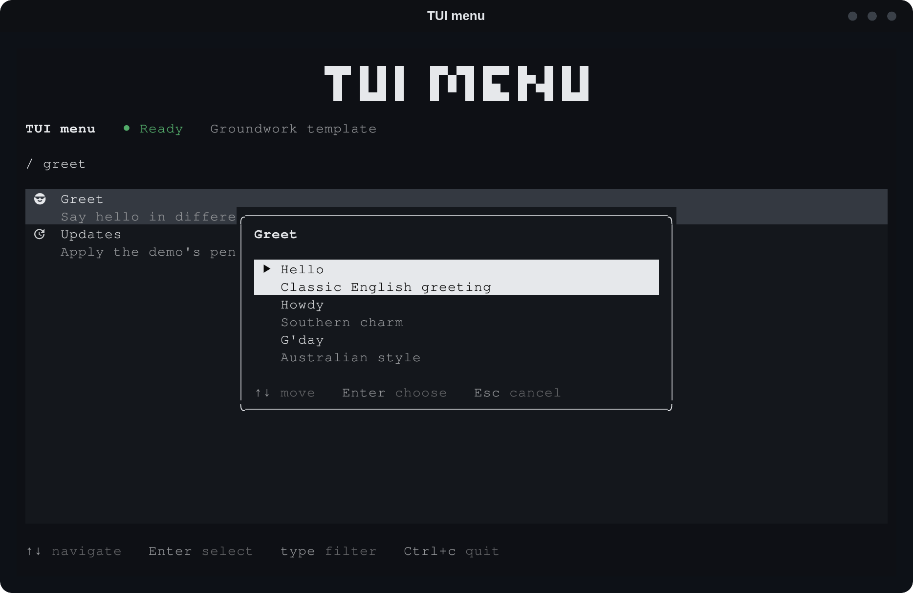
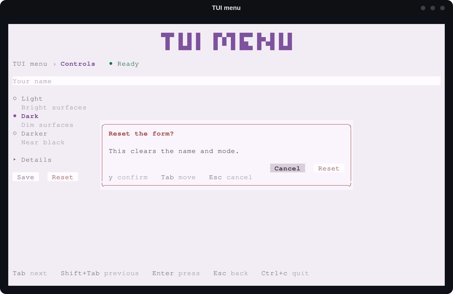
Dialog is a centered panel over the current view. Only one is open at a time: opening another closes the first, and a dialog never opens over a dialog. Esc or a click outside closes it, and focus goes back where it was.
ChoiceDialogpicks one of a list, each with a description, such as the ways to run an action.ConfirmDialogasks yes or no. Focus starts on Cancel, so Enter alone never confirms, andyconfirms. Mark itdestructivewhen the action can’t be undone.
Toast
Toast shows one short message in the top-right corner that closes itself: info, success or error. A new one replaces the old, so they never stack. Use one only for a result nothing on screen can show, such as a command run in the background. Anything the view itself can show, it shows.